Magic: The Gathering is a trading card game I happen to like. It also so happens that there is a database of cards available online. Additionally I (like many programmers) kind-of got into Machine Learning recently. Lets see if we can combine these ingredients to come up with something interesting, shall we? Have you ever wondered whether cards got “cheaper” (in terms of Mana) in the past years or how much more a creature costs because it can fly? How much cheaper is a creature that has Defender? I’ll be toying around with some card data and do some basic data analysis for practice, education and fun. There shall be some (somewhat hacky) Python code using Pandas, SciKit-Learn and Matplotlib in the end that you can use to reproduce (or extend) what I did (you’ll have to wait for the second part for that though).
In this first part we will do some general analysis of the data and see what we can learn about the game with a simple Principal Component Analysis.
Some Magic: The Gathering Vocabulary
For those of you who don’t know it, Magic the Gathering is a trading card game that understands shockingly well how to make me spend ridiculous amounts of money for things as useful as trading cards every now and again. The game (and thus the cards) are about magic sorceries, enchantments and creatures that can be cast by spending a certain amount of Mana. Apart from actually playing the game a big part of the fun is in building your own deck, choosing which cards to combine and to carefully balance the strength of the cards and their Mana cost.
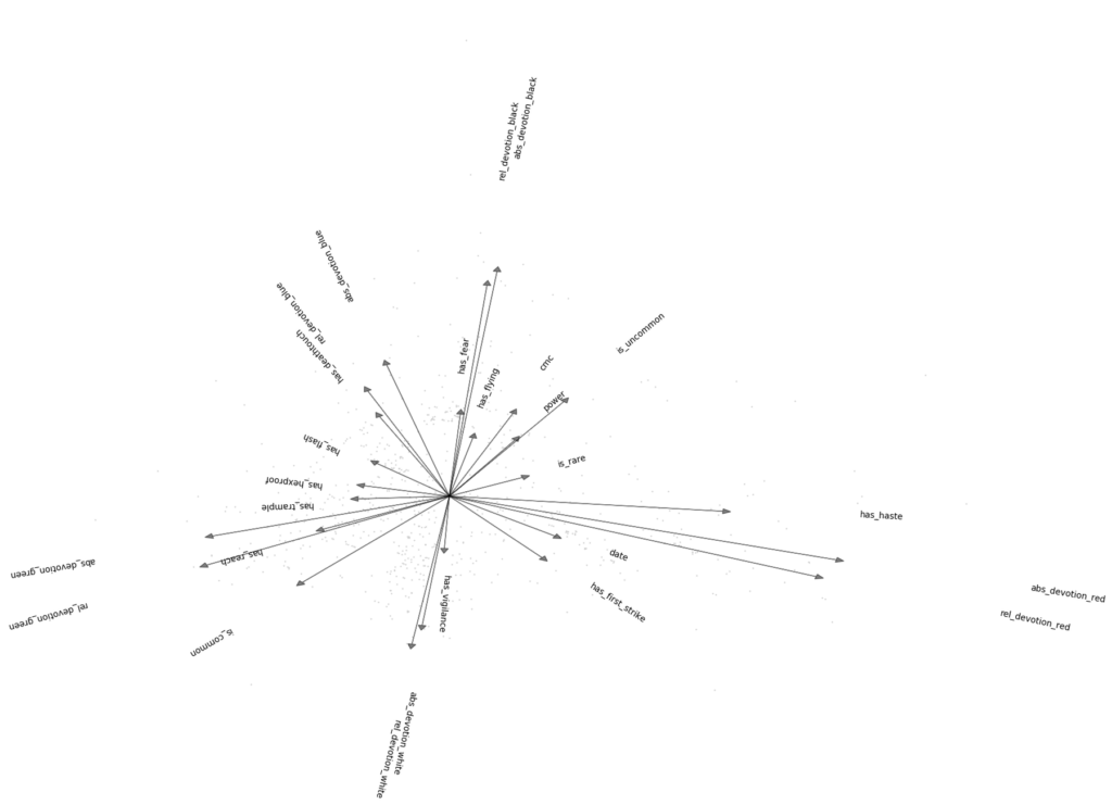
Mana comes in five different colors (White, Blue, Black, Red and Green), which colors you have available during play largely depends on your decisions while deck-building but the general takeaway is that more color “requirements” on a card make it harder to play. Also generally the Mana available to you will grow throughout the game so cards that cost a lot of Mana can usually not be played early. Take for example the Simic Sky Swallower: The Mana symbols in the top right tell us that, in order to cast it, we need to pay 5 Mana of any kind, plus one Green and one Blue Mana.
The Converted Mana Cost (CMC) is the total amount of Mana (regardless of color) that the card costs, in this case, thats 5+1+1 = 7. This particular card is hard to play out for two reasons: For one the CMC of 7 makes it very costly overall, making it very hard to play the card early; additionally it has a Devotion to two different colors, which is harder to fulfill and further decreases the chances of being able to play it. Devotion to a particular color is just the number of Mana symbols of specifically that color. In this case, the devotion to both Blue and Green is 1 each, the devotion to all other colors is 0.
The Data
The data is easily and publicly available online at MTGJSON. It is very complete, and the JSON format makes it handy to process, nice 🙂 Now, what can we actually do with it? Well most cards have a lot of text on them that describes complex rules on how to use it, such as activated or triggered abilities. However that text will be hard to understand (and before somebody screams word2vec, take another look: The problem is in the complex rule system, that would have to be part of the model, not in understanding (similarity of) words).
For this exercise I’ll focus on the more simple cards: That is, cards that have the following properties:
- Only creatures
- No weird cards (like transformable, 2-cards-in-one, tokens, etc…)
- Card texts must consist solely of keywords such as “Flying”, “Trample”, “Shadow” (think of special abilities or properties of creatures, most of which have a positive effect)
While this cuts out the majority of cards (as most of them do have a lot of text), it still leaves us with 689 cards to do some analysis on. For each of those creature cards we can now consider its CMC, devotion to each of the five colors, strength, toughness, which attributes it has, its Rarity (think price category) and age (in the sense of when did it first appear) plus a number of other features (total: 50).
First thing you should do with data is to visualize it to get a feeling what is going on.
Magic: The Principal Component Analysis
Well, let me just draw this 50-dimensional scatter plot… oh wait. That obviously wont be helpful. Luckily Pandas offers us some nice tools for visualization of data, such as the Scatter Matrix Plot. Love the idea. However its still too many dimensions to be able to see anything in that one. We could of course select some subset of features and just look at that, but we don’t really know yet, what is important, so how choose? RadViz by the way has a different problem: It just renders a circle of grey dots (so no information instead of too much). The reason is that many of our features are binary: Either the creature can fly or not, either it is an artifact or not, either it is rare or not.
Maybe we should try to first get rid of all those pesky dimensions, eh?
Principal Component Analysis
I’m not going to go into much detail here about how a Principal Component Analysis (PCA) works internally, you can find tons of tutorials about that online. What it basically does is: Given some data points in some n-dimensional coordinate system, find a transformation to a different n-dimensional coordinate system such that in the first dimension is along the biggest spread of the data, the second orthogonal to that to the next biggest spread etc..
Consider for instance a simple dataset of weight and height of people. Now while there are short and heavy people and long an light ones as well, in general we expect some correlation between height and weight. That is, data will be mostly spread out along some diagonal with some variations to both sides of it for people with a not-so-average body mass index. Running a PCA on that data will transform it such that the new first dimension is the general “bigness” of a person (people on the far end of the x-axis will be long and heavy), while the y-axis will represent the deviation from the average.
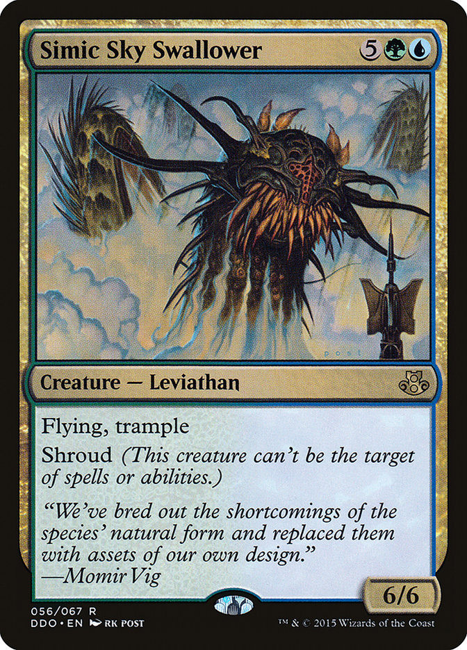
Thanks to the makers of SciKit-Learn its very easy to apply an efficient implementation of PCA to our data. By only considering the first few dimension of the result, we are seeing the most important directions in which our cards spread out. Perhaps even more interestingly, we can also plot the projections of the original feature axis in that new space. This will allow us to get a feeling for what these new dimensions “mean”. Lets take a look:
Ok, lets take this apart. What do we see here? First: Every dot is one of the analyzed cards. The X- and Y- axes are the first two found principal components. The arrows are the projections of some of the original feature axes into our new space, longer arrows mean stronger correlations of feature and principal components. abs_devotion_… here means the absolute devotion to a color (number of mana symbols), while rel_devotion_… refers to the fraction of the CMC that has to paid in this color. Read date as “age in years”.
Some observations:
- The major principal component is close to the power of the creature. Creatures seem to often either have a huge power value or lifelink but rarely both.
- On the other hand, power seems to go hand-in-hand with toughness, high CMC and having trample (if you know the game, that makes a lot of sense)
- The second principal component is pretty much whether a creature is more of a defensive or evasive kind of guy (vigilance, devotion to blue/white, flying) or more in the direct combat / aggressive direction (wither, deathtouch, devotion to red). These seem to be largely independent of the power axis (except for flying and being white which suggests lower power).
- Red and Green devotion is in the lower/right quadrant and according to this classification “aggressive” and high-powered, but pretty much the opposite of flying. (With Green leaning more to the power side and red more to the aggression).
- Black cards seem to have few rares/uncommons in the subset with little text, and can be considered aggressive but low-powered.
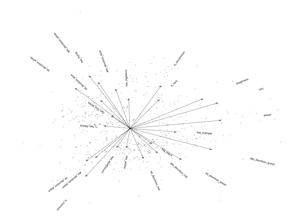
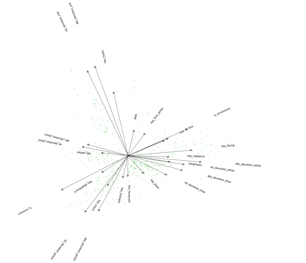
Wow, that’s a whole lot of information that we can suddenly see about the game just by throwing away less important dimensions! For your entertainment I also plotted the next two dimensions, interpretation of those is “left as an exercise to the reader”.
Conclusion
We have not yet answered our questions about how much certain properties (such as Flying) of a creature in Magic: The Gathering affect its mana cost, but in trying to visualize the data we learned a lot about the game and the usefulness of Principal Component Analysis.
In the next part we’ll apply some basic regression techniques to the problem and interpret the result. That will give us some answers (and, of course some caveats that come with them). I’ll also include a link to the code I used for this, but for now I won’t spoil the apprehension for Part 2 for you guys 😉
Wizards of the Coast, Magic: The Gathering, and their logos are trademarks of Wizards of the Coast LLC in the United States and other countries. © 2009 Wizards. All Rights Reserved. This web site is not affiliated with, endorsed, sponsored, or specifically approved by Wizards of the Coast LLC.
2 thoughts on “Magic: The Data Gathering”